In 1975 a Brisbane based group of 12 people drawn from representatives of the Methodist, Presbyterian, and Congregational churches was given the task of coming up with, among other things, the logo for what would be known as the Uniting Church.
Called the “Committee on Paraphernalia and Titles”, the group was also charged with deciding the name of the intended church, the dress and titles of ministers and officers of the church, stationery, and the name given to ministers’ residences.
Thirty years on, the Uniting Church logo they designed is one of the most recognised Christian symbols in Australia.
Committee member and final designer of the logo Jim Gibson said such widespread acceptance of the logo was an unexpected surprise. “We didn’t have a long term vision for it,” he said.
“When we finished the job and passed it over and it was adopted, I think we felt that that would be a symbol for the establishing of the church and it might just disappear. But it has been adopted by the church everywhere. It is amazing how it has been accepted.”
“It has become owned by the people of the Uniting Church. We wear it on our name tags and have it on the backs of our motor cars.”
From start to finish the design process took about a year to evolve into the symbol we know now. At first a firm of graphic designers was asked to come up with some ideas, but Mr Gibson said the resulting images didn’t reflect what the new church was trying to say.
“None of them struck a chord with us, although they are all quite clear in presentation and would all reproduce well, but they didn’t say what we wanted to say theologically, and I am not sure we knew at that stage anyway.
“At the time I believed that the symbol incorporated a theology that was believed should to be at the core of the Uniting Church and that was what we were trying to express, although we didn’t know where we would find it.”
Consequently the committee took a different path that involved a call-out to the three churches for designs and thoughts on what they believed the logo should include. Many of these designs included a Trinity theme as well as the Southern Cross, the cross, a boat and the letters “UCA”.
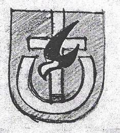
“We focused on two symbols that came out of these. One was the dove with wings of flame, the other was the cross over the broken circle. We felt that those two symbols encapsulated the sorts of things that were at the core of the church as it was coming in to union.”
It was Mr Gibson’s job to turn these ideas (submitted by Rob Evans, Christine Gillman, and Don Hutton) into a graphic symbol. The result was an image where the combination of the parts reflected the Uniting Church’s place in the world.
“A white cross over the darkened world, the people of God gathered at the foot of the cross reflecting the light of the cross (both blotting out the darkness of the world) and then the image of the Holy Spirit which brings both peace and energy emanating from the cross and touching the people of God.”
In recent years there has been talk of modernising the logo. Journey asked Mr Gibson what he though was the right decision about reworking the logo. “If there are moves to make it an image that is considered to be modern, that is fair enough and might lead to a much better symbol, but I think it would be very important not to lose the meaning and the intent of the various parts of the symbol and the correlation of each bit,” Mr Gibson said.
“The interrelationships of those parts of the symbol have great importance and in any modernising or reworking of the symbol I think those elements should be retained so clearly that it wouldn’t be seen to be a new symbol at all, otherwise the association that has been built up over the 30 years could be lost.”
Photo: One of the later designs in the process